Advertisement
How data visuals can help to recast climate change stories
Saturday 10th May, 2025 03:00 AM|
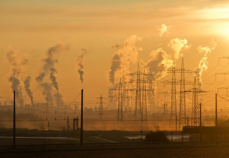
Scientists and journalists are increasingly relying on the power of data in telling environmental and climate change stories for diverse audiences.
Data helps audiences visualise and contextualise events and scenarios, transforming complex scientific findings into accessible narratives. Data also builds credibility, combats misinformation, and makes narratives localised and accountable.
One expert recently sought to apply data in finding out how climate change feels like, how will your city’s climate shift, 50 years from now, and how we can better understand the long-term effects of climate change.
These were the issues Derek Taylor, a data scientist and geographic information system (GIS) specialist, explored in a piece for The Pudding, a digital publisher which produces data journalism for storytelling. Articles in the publication are visual essays which emphasise data visualisations and use fewer words than conventional journalism.
You Might Also Like


Expanding on an earlier article about climate change in Africa, Taylor sought in his latest piece in The Pudding, to reimagine the climate future of cities on a global scale.
Breaking down concepts
Writing in Storybench, Darin Zullo said Taylor’s initial point was thinking about how cities feel (and) how people don’t necessarily experience the climate, they experience the weather.
Storybench was founded as a “cookbook for digital storytelling” in 2014 out of the Media & Data Communication program at Northeastern University’s School of Journalism. It has since evolved into an all-in-one destination for media professionals interested in using advanced digital tools to tell impactful stories.
The resulting interactive story, Climate Zones, visualises the specific effects of climate change on 70 cities across all five distinct climate zones – arid, tropical, temperate, cold and polar – as well as their subcategories.
Utilising a dataset that compares 2023 climate statistics with projected 2070 climate statistics, Taylor shows just how differently these cities will pair with these climate zones over time.
What inspired Taylor to address the issue of climate change this way?
“A lot of climate reports and climate articles that I was looking at were all based around really heavy scientific jargon and intangible data points.
“Looking at something like average sea temperature rise, they don’t really bring the point home if you just say they are warming oceans by one degree Celsius. Some of these things felt very abstract, even though obviously the repercussions and results of these things would be quite drastic,” explains Taylor.
He says one of the foundational lines was thinking about how weather might be different in the future and also about a good way to think about temperature changing.
“I was also thinking about relational changes as well, so not just saying that New York City is going to get warmer, but actually New York City (in 2070) will feel more like Barcelona in 2023”.
Regarding what a visual representation of this global issue offer that statistics alone might not able to accomplish, Taylor says he thinks it humanises the data a little bit.
“It’s an attempt in sacrificing extreme specificity. Although it does show you that X city rises by five degrees Fahrenheit, that’s the less important storyline of the article, and the more important one is thinking about how these groups of cities will compare in 2070 to cities today”.
Global cities
The categorisations were informed by the history of climate research and he found the dataset quite early on.
“Even before I started thinking about the weather and how cities feel, I was finding this dataset that had the 2023 and 2070 cities placed. It’s a dataset of the entire world that shows all the locations of these different climate classifications.
Taylor found this really interesting because it unlocked the idea that a 90-degree day in Sacramento, where he comes from, and a 90-degree day in Boston feel really different.
“It doesn’t just have to do with temperature, and these climate classifications might have the same temperature but ultimately feel very different”.
In deciding which cities to include in the visualisation, Taylor’s first goal was to choose cities equally across the different climates.
Obviously, most of the global cities exist in the temperate zones just because humans have settled in temperate locations. “One thing was to try to get cities that represent all the different classifications so there are starting points for comparison. The second was choosing cities that people would have some kind of mental picture of it. Even if someone might not have visited New Delhi, they’ve seen a depiction of New Delhi where, when you say Los Angeles will have a similar climate in 2070 to New Delhi, there’s a mental image there”.
On the coding tools used to create the data story and what the process was like, Taylor says the big takeaway is definitely thinking about trying to make the story as simple as possible and every step of the way asking oneself what are the main things that one wants the reader to take away.
“If you work backwards from that, it becomes more clear what things you need to visualise and how you need to visualise them. You have to ultimately come out with a more chiseled project that is still technically impressive but doesn’t need all the flashy bits,” Taylor notes.
All the data cleaning, processing, and that sort of work was done either in Python (a programming language that lets you work quickly and integrate systems more effectively) or on Postgres (a database, an organised collection of structured data, typically stored electronically in a computer system).
The standard way to create and manage databases is SQL (Structured Query Language), the building block for some of the most popular relational databases such as PostgreSQL, Microsoft SQL Server, MySQL, and SQLite, which can be connected and managed using Python.
“The actual data side of this project was the easiest; I had the dataset ready and cleaned and sorted in about a week. The big workload was the visualisation tools and creating the story,” recalls Taylor.
He previously worked on a similar project with a specific focus on Africa, which helped as outline for Climate Zones.
“I’d made the 3D-rendered Africa map with a dataset overlaid, and I wanted to overlay a different dataset on it, I started off with big dreams to do a data for every single continent, but I quickly realised that was going to too big to pull off, so that’s how it got narrowed down a bit from being so broad.”
The project has given Taylor new perspectives on approaching data science, adding to his day-to-day work on front-end development and interactive data visualization.
“The big takeaway is thinking about trying to make the story as simple as possible and every step of the way asking what are the main things you want the reader to take away.”
On what he hopes his audiences will take away from the project, Taylor’s main hope is that readers get a different perspective on climate change and that potentially it hits home more than reading a more scientific approach to reporting about climate change.
Author
Alberto Leny
View all posts by Alberto LenyLatest News


Advertisement
More on News